Finally, I dare to grab my favorite color. There should be no such thing at all, and all the colors should receive the equal treatment they deserve. Just like choosing the most loved one among your kids. However, that is not exactly how it goes. Turquoise has always felt as my own color.
The most amazing “scientific” texts you come across regarding your favorite colors and how they are used to interpret personalities. Turquoise helps to clarify thoughts and soothe in all respects, while facilitating communication and internal integration. It allows creativity to flourish, promoting spiritual development, strengthening intuitive forces, and elevating toward the heights of the soul. Excuse me?
Because I like turquoise, I am, therefore, as follows:
“You are trying to create balance in your life as you swing emotionally from one direction to the other. Although presenting a cool and calm Exterior, and appearing to be stable and balanced, beneath the surface you may be in Chaos, is an emotional roller coaster ride.”
Does the talk of color give the right to free all the stupidity and the whole arsenal of nonsense?
I remember once attending a confusing academic lecture. The lecturer, the professor, spoke about a research set-up in which, in the laboratory, subjects looked at one color and at the same time measured their vital functions to arrive at the strangest conclusions about the effects of colors. However, the world is not as simple as a laboratory space isolated as a box. Colors occur in a variety of materials and objects, in conjunction with a large number of other objects and materials. They are perceived in different operating contexts and strange lighting conditions, with different expectations.
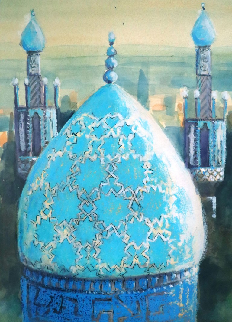
Turquoise as a color name comes, of course, from Turkey (turquoise) through French. In cultures where turquoise stone has been found in the soil, that color has been considered to bring blessing, happiness and security. There are these cultures on both sides of the globe, seen from us both east and west on the American continent and in the Middle East, well actually already from Greece to the east.
Turquoise is close to cyan, which forms the blueish primary color in the CMYK color system. This is always the color system in graphic products.
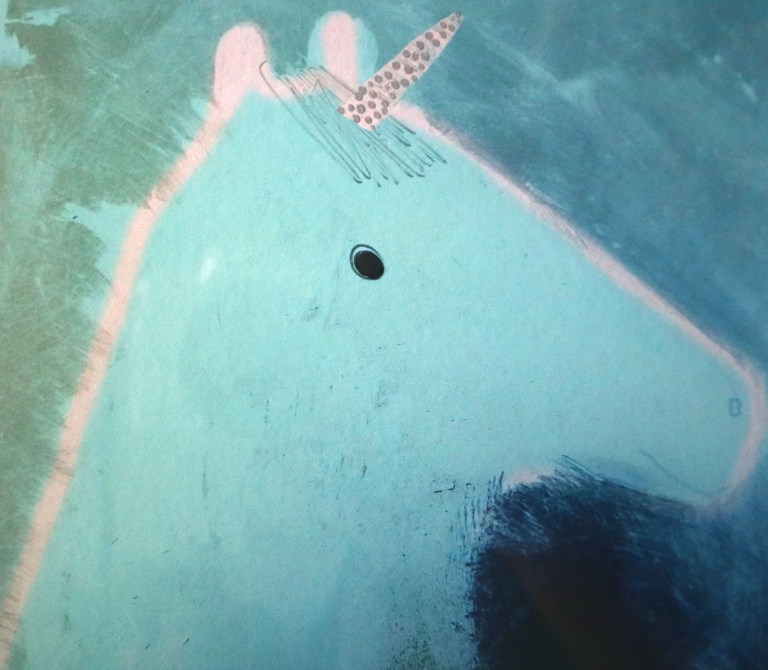
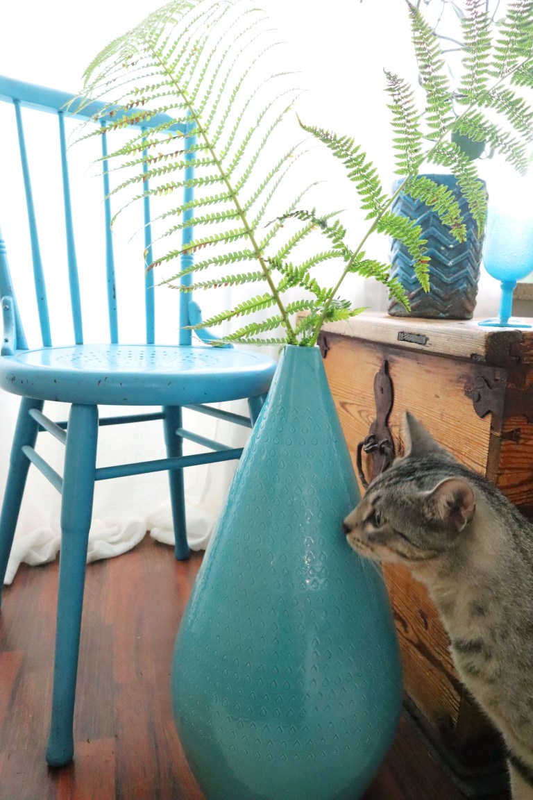
In the works found on my walls, turquoise seems to dominate, as do other objects chosen for home decoration. I still don’t agree with those horoscopic definitions of different “energies” that exude my personality. Culture can, of course, be interpreted culturally and its historical connections can be considered, in which case our thoughts about color also guide our minds on some level.
Viimein uskallan tarttua lempiväriini. Sellaistahan ei pitäisi olla lainkaan, vaan kaikki värit saakoon ansaitsemansa tasavertaisen kohtelun. Aivan kuin valitsisi lapsistaan lemmikin. Ei se kuitenkaan ihan näin mene. Turkoosi on tuntunut aina omalta väriltä.
Mitä hämmästyttävimpiin ”tieteellisiin” teksteihin törmää koskien lempivärejä ja sitä, miten niiden avulla tulkitaan persoonallisuuksia. Turkoosi auttaa ajatusten kirkastumista ja rauhoittaa kaikin puolin, samalla helpottaen kommunikaatiota ja sisäistä eheytymistä. Se antaa luovuuden kukoistaa, edistäen henkistä kehittymistä, vahvistaa intuitiivisia voimia ja kohottaa kohti sielun korkeuksia. Anteeksi kuinka?
Koska pidän turkoosista, olen siis seuraavanlainen:
“You are trying to create balance in your life as you swing emotionally from one direction to the other. Although presenting a cool and calm exterior, and appearing to be stable and balanced, beneath the surface you may be in chaos, on an emotional roller coaster ride.“
Antaako puhe väreistä oikeuden päästää koko typeryyden ja humpuukin arsenaali vapaaksi?
Muistelen aikanaan osallistuneeni hämmentävään akateemiseen luentotilaisuuteen. Luennoitsija, professori kertoi tutkimusasetelmasta, jossa laboratoriossa koehenkilöt katsoivat yhtä väriä ja samalla heidän elintoimintoja mittaamalla päädyttiin mitä kummallisempiin päätelmiin värien vaikutuksista. Maailma ei kuitenkaan ole yhtä yksinkertainen kuin laatikoksi eristetty laboratoriotila. Värit esiintyvät erilaisissa materiaaleissa ja esineissä, yhteyksissä suureen määrään muita esineitä ja materiaaleja. Ne havaitaan eri käyttökonteksteissa ja oudoissa valaistusoloissa, erilaisin odotuksin varusteltuina.
Turkoosi värinimenä tulee tietenkin Turkista (turquoise) ranskankielen kautta. Kulttuureissa, joissa maaperästä on löytynyt turkoosia kiveä, on tuota väriä pidetty onnea ja turvaa tuottavana, siunaavana. Näitä kulttuureja on maapallon molemmilla puoliskoilla, meistä katsottuna sekä idässä että lännessä Amerikan mantereella ja Lähi-idässä, no oikeastaan jo Kreikasta itään.
Turkoosi on lähellä syaania, joka muodostaa CMYK-värijärjestelmässä sinipitoisen päävärin. Tähän värijärjestelmään graafisissa tuotteissa aina päätyy.
Seiniltäni löytyvissä teoksissa turkoosi näyttää hallitsevan, samoin kuin muissa kodin koristukseksi valituissa esineissä. En silti suostu noihin horoskooppimaisiin erilaisia ”energioita” huokuviin määrittelyihin persoonastani. Väriä voi kulttuurisesti tietenkin tulkita ja pohtia sen historiallisia yhteyksiä, jolloin myös mielteet väristä ohjaavat jollain tasolla mieltämme.