In the trend forecasts S / S 20 (i.e. spring and summer 2020), in addition to orange yellows, it is expected to spread from youth fashion to all people. Prepare for a color joy that bridges the gap between the generations. Already S / S 19 is expected to combine rust and earth tones between spicy oranges and hot reds. Roughly these words are therefore promising predictions:
“Oranges and yellows have been gaining ground for the past few seasons, but in S/S 20 they will move beyond the youth market and hit mass appeal. Get ready for an inter-generational explosion of colour.” (WGSN)
or
“Rust and earth tones pair up with shades of spicy orange and red for a scorching hot S/S 19 look.”
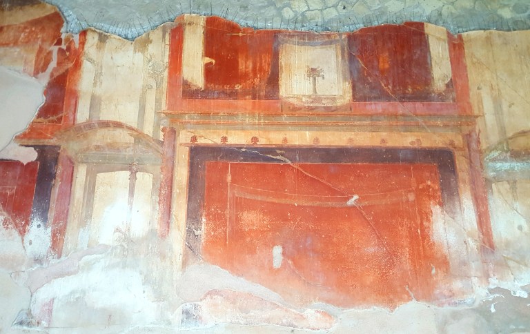
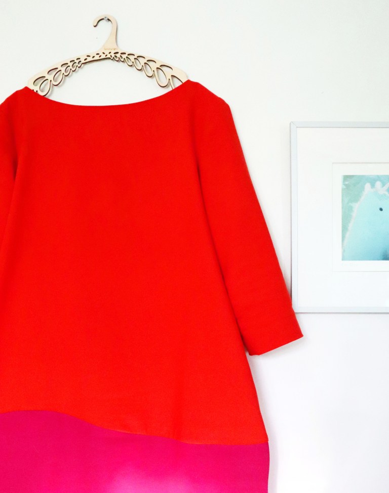
The cinabro and the magenta red long for each other and they have found their pair in Marita Huurinainen’s dress, in the balance of cold and warm tones. The red dress is especially loaded with heavy connotations. Even from biblical times, the red robe on a woman is outright the back wall of hell. The alluring red dresses of the sinful entrance to perdition have appeared in movies and popular illustration to the cliché. Interestingly, that combination of cinnabar-magenta is perhaps precisely what makes it a lush combination of warm orange-red and purple-tilted magenta of the Catholic Church clergy. This led to Italy again. The red-orange pair is only missing the red walls of Pompeii. They are today amazingly bright and brilliant. The red glow has required special expertise in the size of the colored crystals and their bonding to each other. Persian red is an even deeper and more saturated version of these shades.
Roland Barthes:
When I buy colors, it is because of their name. The name of the color (Indian yellow, Persian red, Celadon green) outlines a kind of Generic region within which the exact, special effect of the color is unforeseeable; the name is then the promise of a Pleasure, the program of an operation: there is always a certain future in the complete names. Similarly, when I say that a word is beautiful, when I use it because I like it, it is never by virtue of its sonorous charm or of the originality of meaning, or of a “Poetic” combination of the two. The word transports me because of the notion that I am going to do something with it: it is the thrill of a future Praxis, something like an appetite. This desire makes the entire motionless chart of language vibrate.
Roland Barthes by Roland Barthes translated by Richard Howard
I sign Roland Barthes’s statement that the name is a promise. The name of the color may be a promise of pleasure, long voyage, beauty. The name may be a poetic vibration. Sinooberi before the bankrupt craft trade (this shop was in Finland), Vermillion, the French flair for eroticism and red lips, Pompeii or Persia in the history of lost distant lands. (In reality, however, the vermillion refers to the worm, ver, that is, the Kermes insect and the colorant derived from it.) The food contents E120 contains the same carmine, dried from the female Dactylopius coccus insect. Cotê Vermeille is unexplored in the south of France from Argelès-sur-Mer to Cerbère, but still on the Bucket list.
Trendiennusteissa S/S 20 (eli kevät ja kesä 2020) oranssien keltaisten ohella povataan leviävän nuorisomuodista kaiken kansan pariin. Varaudu sukupolvien välisen kuilun päräyttävään väri-ilotteluun. Jo S/S 19 on odotettavissa ruosteen ja maavärien yhdistelyä mausteisten oranssien ja kuumien punaisten kesken. Suunnilleen näillä sanoilla siis lupaavat ennusteet.
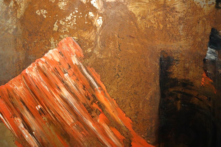

Kuvassa Mikko Paakkosen ruosteista ja mausteista Mäntän kesänäyttelyssä sekä Salvador Dalin punaisenoranssia kuvauskulissia.

Sinooperi ja magentan punainen kaipaavat toisiaan ja ovatkin löytäneet parinsa vaikkapa tässä Marita Huurinaisen mekossa, kylmän ja lämpimän sävyn tasapainossa. Punaiseen mekkoon on erityisesti ladattuna raskaita konnotaatioita. Jo raamatullisista ajoista punainen vaate on naisen yllä suorastaan helvetin peräseinä. Synnillisen sisäänkäynnin houkuttelevia punaisia mekkoja on esiintynyt elokuvissa ja popuulaarikuvastossa kliseeksi asti. Kiinnostavaksi tuon sinooperi-magenta yhdistelmän tekee ehkä juuri hekumallisen lämpimän oranssinpunaisen ja katolisen kirkon papiston violettiin kallistuvan magentan yhdistelmä. Tästä päästiinkin jälleen Italiaan. Punaoranssien parista puuttuu enää Pompeijin punaiset seinät. Ne ovat hämmästyttävän kirkkaat ja loistavat. Punaiseen hehkuun on tarvittu erityistä asiantuntemusta värikiteiden koosta ja sitoutumisesta toisiinsa. Persian punainen on näistä sävyistä vielä syvempi ja kylläisempi versio.
Roland Barthes:
When I buy colours, it is by the mere sight of their name. The name of the colour (Indian yellow, Persian red, celadon green) outlines a kind of generic region within which the exact, special effect of the colour is unforeseeable; the name is then the promise of a pleasure, the program of an operation: there is always a certain future in the complete names. Similarly, when I say that a word is beautiful, when I use it because I like it, it is never by virtue of its sonorous charm or of the originality of meaning, or of a ”poetic” combination of the two. The word transports me because of the notion that I am going to do something with it: it is the thrill of a future praxis, something like an appetite. This desire makes the entire motionless chart of language vibrate.
Allekirjoitan Roland Barthes’n toteamuksen, että nimi on lupaus. Värin nimi saattaa olla lupaus nautinnosta, kaukomatkasta, kauneudesta. Nimi saattaa olla poeettinen värähdys. Sinooberi ennen konkurssiin mennyttä askartelukauppaa, Vermillion, ranskalainen häivähdys erotiikkaa ja punaisia huulia, Pompeiji tai Persia historiaan kadonneina kaukomaina. (Todellisuudessa vermillion tosin viittaa matoon, ver, siis Kermes -hyönteiseen ja siitä saatuun väriaineeseen.) Elintarvikkeiden sisällysluetteloissa E120 on samaista karmiinia, kuivattua Dactylopius coccus –hyönteisnaarasta. Cotê Vermeille on tutkimatta Etelä-Ranskassa Argelès-sur-Meristä Cerbèreen, mutta Bucket-listalla yhä.