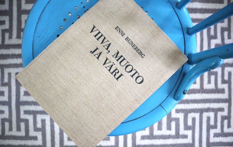
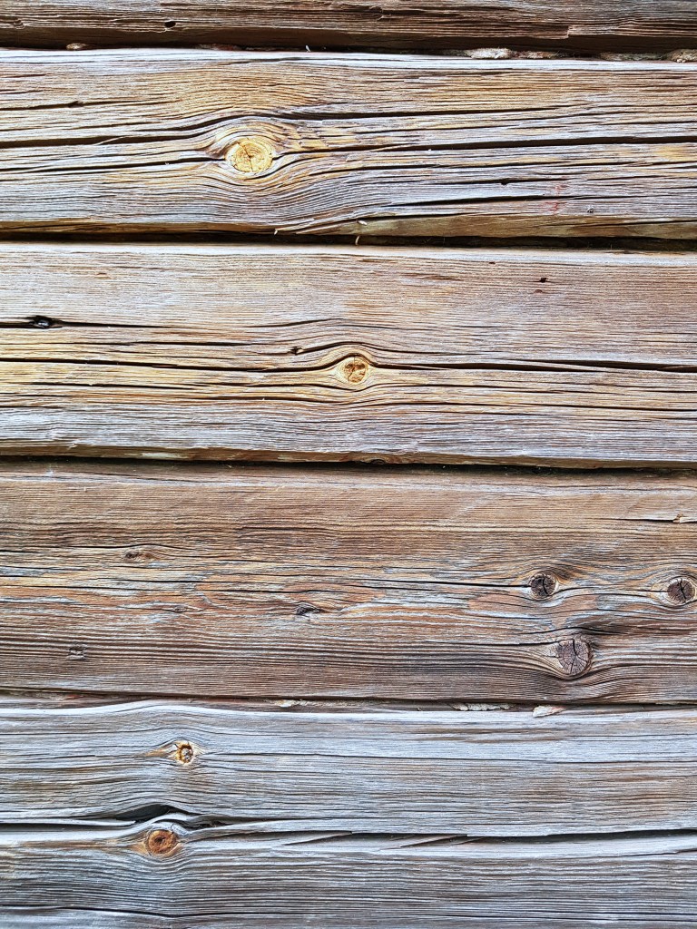
The reflection of the colorful gray continues in the warm. In the previous story, Taupe already had the aura of authenticity. Here’s even more authenticity in the log wall and undyed linen. Enni Runeberg’s linen-covered work from 1934 provides detailed instructions and task tips for teaching drawing. She, too, repeats that same modernist argument about the connection between bright colors and lower degrees of civilization. She also gives an explanation to why saturated (pure) and vibrant (!) colors are not popular in high civilization.
“A more sophisticated sense of color suffers more from mismatched color combinations. Saturated (pretty) colors show an error in harmony even in relatively small nuances.”
Therefore.
On the other hand, the lower social classes were condemned for centuries to a mole-colored environment, the colors were expensive, or their use was restricted by regulations to different social classes.
The following charming reference from promoting tourism in Kainuu in 1926 reveals one of the reasons for the Finnish greyness and the general ugliness of the environment (compared, of course, to the Swedish one), in addition to stinginess, inherent modesty:
“The main reason is that painting a house is considered a kind of exaggeration, boasting. The painting of the house is thus against to the sacred traditions. And perhaps before all, painting the house in old days had been a bit dubious, as the painted house would have put more in the eyes of enemies. The gray tone is therefore a protective color. ”
Referred from the site Coloriasto, which includes comprehensive and extremely interesting material for anyone interested in the history of color in Finland and Scandinavia.
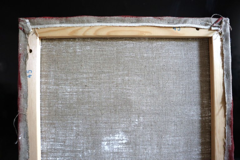
My most beautiful mole color experience is related to the rough linen painting canvas. Its scent and roughness are promises of unrealized possibilities, of a work in coming. In that way, this unspeakable grayness can also be associated with hope when returning back to work.
In these wings of Jussi Heikkilä’s work, you can either see or not see that potential, on that gray concrete wall.
Värikkään harmaan pohdinta jatkuu lämpimässä. Edellisessä tarinassa jo taupe sai kantaakseen autenttisuuden auran. Tässä vielä lisää aitoutta hirsiseinässä ja värjäämättömässä pellavassa. Enni Runebergin pellavakantisessa teoksessa vuodelta 1934 jaetaan yksityiskohtaisia ohjeita ja tehtävävihjeitä piirustuksen opetukseen. Myös hän toistaa tuota modernistien väitettä kirkkaiden värien ja alempien sivistysasteiden yhteydestä. Hän myös antaa selityksen miksi kyllästetyt (puhtaat) ja vilkkaat (!) värit eivät ole suosittuja korkean sivistyksen piirissä.
”Kehittyneempi väriaisti kärsii enemmän epäsointuisista väriyhdistelmistä. Kyllästetyissä (koreissa) väreissä ilmenee sointuisuutta koskeva virhe jo suhteellisen pienissä vivahteissa.”
Siksi siis.
Toisaalta alemmat yhteiskuntaluokat olivat vuosisatoja tuomittuja myyränväriseen ympäristöön, värit olivat kalliita tai niiden käyttöä oli rajoitettu säännöksin erilaisille yhteiskuntaluokille.
Seuraava hurmaava matkailunedistämiskeino vuoden 1926 Kainuun sanomista todistaa yhtenä syynä suomalaiseen harmauteen ja yleiseen ympäristön rumuuteen (verrattuna tietenkin ruotsalaiseen) nuukuuden lisäksi luontaisen vaatimattomuuden:
”Tärkein syy on siinä, että talon maalaamista pidetään jonkinlaisena rehentelemisenä, pröystäilemisenä. Talon maalaaminen on siis wanhojen pyhien perinnäistapojen wastaista. Ja ehkä ennen wanhaan talon maalaaminen olikin ollut hiukan epäiltäwää, sillä maalattu talo olisi enemmän pistänyt wainolaisten silmiin. Harmaja wäri on siis suojeluwäri.”
Sivustolta Coloriasto, joka on todella kattava ja äärimmäisen mielenkiintoinen aineisto kaikille vähänkään väreistä kiinnostuneille.
Kaunein myyränvärin elämykseni liittyy karkeaan pellavaiseen maalauspohjaan. Sen tuoksu ja karheus ovat lupauksia jostain toteutumattomasta mahdollisuudesta, teoksesta tulollaan. Että sillä lailla tuohon mitäänsanomattomaan harmauteen voi liittyä myös toivoa näin töihin palatessa.
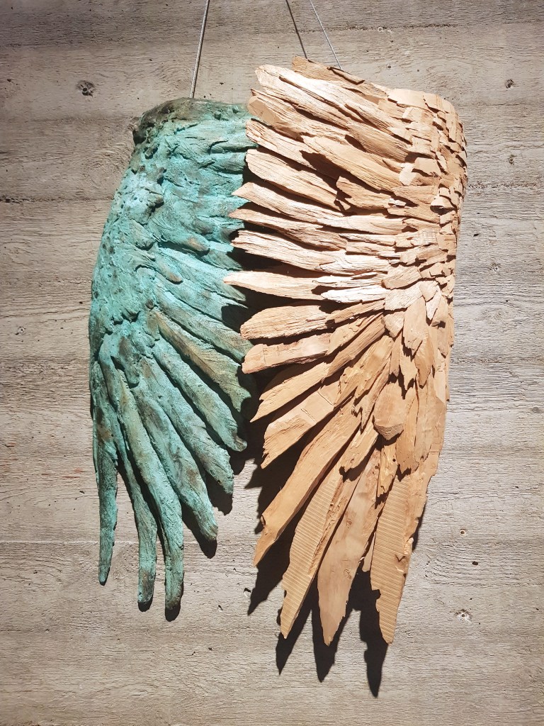
Näissä Jussi Heikkilän teoksen siivissä voi joko nähdä tuon potentiaalin tai olla näkemättä, siinä betoniseinällä.
