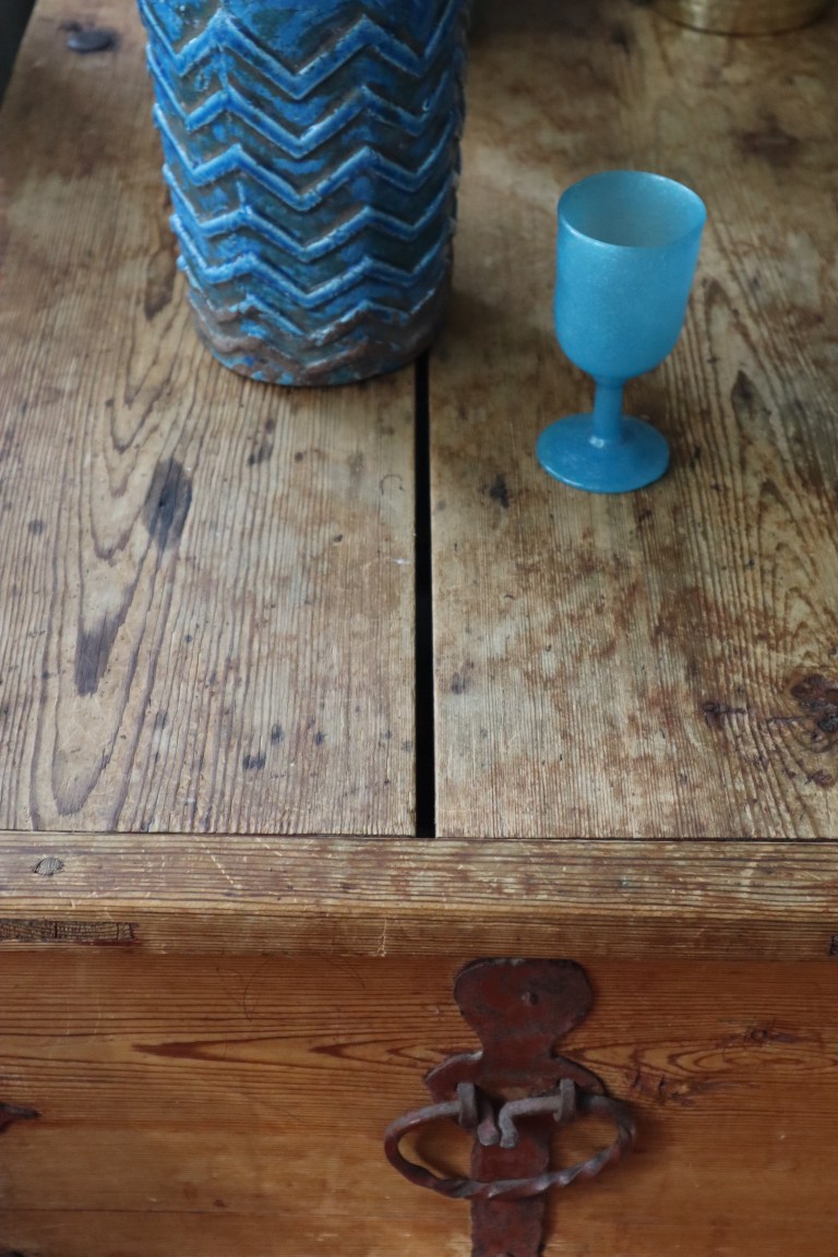
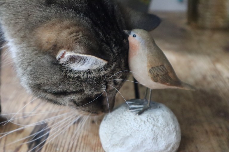
Let the mole color or gray-brown be the color of the weeks after the holidays. In all its mundane character it may seem like a contradictory choice during the hottest moments of the summer, however, its gray tone reflects the innermost feelings when returning to work. Discoloration, color remaining in the watercolor cup after the painting session, color of a wet muddy road, mole, cat’s back, sparrow, colorless color.
In Hannu Väisänen’s story, the house of a submarine officer and his wife is mole-colored.
”When he speaks to his warm gray walls, he feels like his voice is getting stronger, because the silence of the wall echoes the grayness of the mole.”
I have sited in several occasions Adolf Loos, one of the Great Authorities of the early years of the 1900s modernism. He states that bright colors please only children, primitive peoples, and women. He speaks in favor of the gray and the colorless. (According to Loos, men have fortunately reached a higher level of civilization, at least in their dress, on their monochrome, low-key scale.) However, I had not peeked into the interiors designed by the same gentleman. To my astonishment they are full of the wildest color combinations, like Villa Müller in Prague from the 1930s. The only coloring Loos condemns in this context is imitative. Wood should not be painted in wood color or imitate a marble surface with decorative painting, everything else is allowed.
Another statement from the modernist authority. Le Corbusier has also often been quoted as combining bright colors with simple, undeveloped groups of people, peasant or wild. This, too, perhaps is taken from a larger context. Le Corbusier, however, admired the phenomena of his non-Western culture in the way of his own contemporaries. He became enthusiastic about jazz and is posing in pictures with Josephine Baker in the 1920s.
Le Corbusier has a fine color chart from 1931 (Salubra, Claviers de couleur) in the spirit of gray concrete and modernism. There can be even be more gray tones than those clichéd “Shades of…”.
The patinated old grayish wood is one of the most beautiful manifestations of the mole color. Let’s enjoy the satin surface of old log buildings or the sparrow of colorless color or the natural shade of linen even in summer.
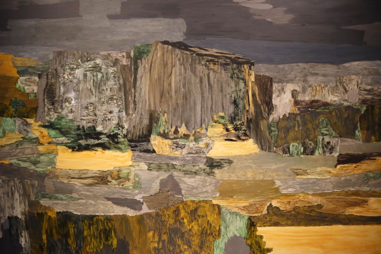
If that mole color seems too leady, you can even explore Giorgio Morandi’s still lives or these brownish-gray color delights seen in summer shows.
Petri Yrjölä, part of the work Memory of a Swamp, in Sara Hilden’s summer exhibition. Like the next painting by Andreas Eriksson.
Myyränväri tai harmaanruskea olkoon lomanjälkeisten viikkojen väri. Kaikessa arkisuudessaan se saattaa tuntua ristiriitaiselta valinnalta kesän kuumimpina hetkinä, sen harmaus soittelee sisimpiä tuntoja kuitenkin töihin palatessa. Epäväri, väri, joka jää vesivärikuppiin maalaussession jälkeen, märän maantien väri, myyrä, kissan kylki, varpunen, väritön väri.
Hannu Väisäsen tarinassa sukellusveneupseerin ja hänen rouvansa talo on myyränvärinen.
”Kun hän puhuu lämpimän harmaille seinilleen, hänestä tuntuu kuin hänen äänensä vahvistuisi, koska seinän vaikenemisessa kaikuu koko myyrän harmaus.”
Olen lainannut useissa yhteyksissä Adolf Loosia, yhtä monista 1900-luvun alkuvuosien modernismin herra-auktoriteeteista. Hänen huomionsa kirkkaista väreistä, jotka miellyttävät lapsia, primitiivisiä kansoja ja naisia, puhuu harmaiden ja värittömien puolesta. (Loosin mukaan miehet ovat onnesta päässeet ainakin pukeutumisessaan korkeammalle sivistyksen tasolle yksivärisessä, hillityssä skaalassaan.) Olin kuitenkin jättänyt kurkistamatta samaisen herran suunnittelemia interiöörejä. Ne ovatkin täynnä mitä hurjempia väriyhdistelmiä, kuten Villa Müller Prahassa 1930-luvulta. Ainoa väritys, jonka Loos tuomitsee tässä yhteydessä, on imitoiva. Puuta ei tule maalata puunväriseksi tai imitoida marmoripintaa koristemaalauksella, kaikki muu olkoon sallittua.
Toiselta modernisti-herralta Le Corbusierilta on myös usein lainailtu lausahdusta kirkkaista väreistä liitettynä yksinkertaisiin, kehittymättömiin ihmisryhmiin, maalaisiin tai villeihin. Tämäkin ehkä isommasta kontekstista reväistynä. Le Corbusier kuitenkin ihaili oman aikalaistensa tavalla muiden kuin länsimaisen kulttuurinsa ilmiöitä. Hän innostui mm jazzista ja poseeraa kuvissa Josephine Bakerin kanssa 1920-luvulla.
Le Corbusierilta löytyy hieno värikartasto vuodelta 1931 (Salubra, claviers de couleur) harmaan betonin ja modernismin hengessä. Harmautta voi olla sitäkin enemmän kuin ne kliseiset ”Shades of…”.
Patinoitunut vanha harmahtava puu onkin myyränvärin kauneimpia ilmentymiä. Nautitaan vanhojen hirsirakennusten satiinisesta pinnasta tai siitä ei-minkään värisestä varpusesta tai pellavan luonnollisesta sävystä näin kesälläkin.
Jos tuo myyränväri vaikuttaa liian pliisulta, voi tutkailla, vaikka Giorgio Morandin asetelmia tai näitä kesänäyttelyissä nähtyjä ruskeanharmaita väri-ilotteluja.

Petri Yrjölä, osa teoksesta Suon muisti, Sara Hildenin kesänäyttelyssä. Kuten seuraava Andreas Erikssonin maalauskin.
Ja Purnussa Miikka Vaskolalta:


