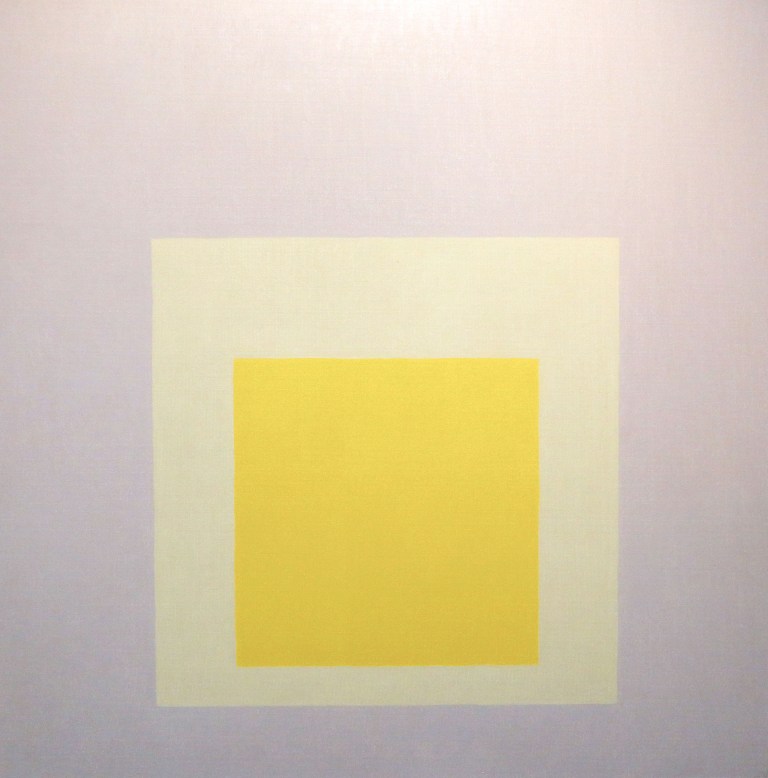
On the opposite walls of the exhibition hall, yellow squares look at each other. Some of the most significant artists who have influenced my own perceptions of color, real color researchers Josef Albers and Marika Mäkelä, engage in dialogue in Sara Hilden’s Art Museum’s summer exhibition. Both have ended up framing their yellow squares with a gray frames. It is impossible to determine the shade of gray, whether it is really a bit bluish or brownish warm.
This is the goal of color juxtaposition exercises performed by Albers for color perception and sensitization. Simultaneous contrast acts as a bubbler of the imagination (in Hollo’s words). The effect of yellow on neutral gray needs to be studied in a focused way without achieving definitive certainty. What do I really see?
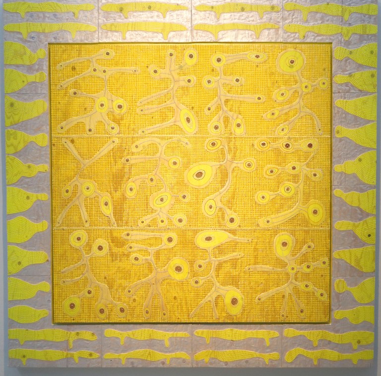
The gray carved in Marika Mäkelä’s plywood is blue, after all. Glittery yellows glow between the powdery color pigment and the grayish, almost velvety wood surface creates a contrast that evokes the senses.
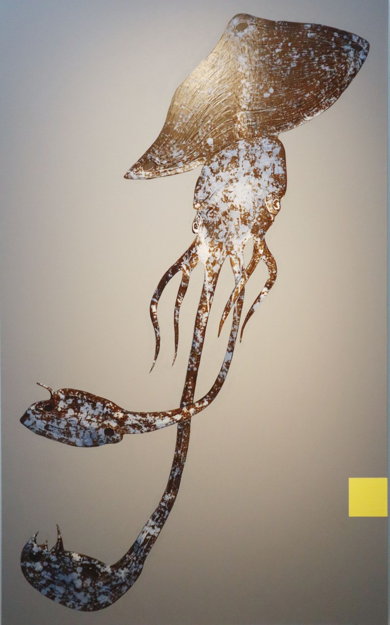
Osmo Rauhala’s small yellow square attaches to the edge of the gray background as before.
How color and material are equal, how intense can color be? The colors are insulated in frames and lit in white rooms. Look at me. As I said earlier after choosing the color of the week, I see it everywhere. Today, at the Sara Hilden Museum’s summer exhibition, yellow erupted from every frame. Eventually, even the almost yellows also turned greenish-yellow or orange-yellow.
Näyttelysalin vastakkaisilla seinillä toisiaan katsovat keltaiset neliöt. Sara Hildenin kesänäyttelyssä dialogia käyvät eräät merkittävimmistä omaan värikäsityksiini vaikuttaneista taiteilijoista, todelliset väritutkijat Josef Albers ja Marika Mäkelä. Molemmat ovat päätyneet kehystämään keltaisen neliönsä harmaalla kentällä. Harmaan sävyä on mahdotonta määritellä, onko se todellakin noin sinertävä vai sittenkin rusehtavan lämmin.
Tähän Albersin värien havainnointiin ja sen kautta herkistämiseen tehdyt värien rinnastusharjoitukset tähtäävät. Simultaanikontrasti toimii mielikuvituksen kuohkeuttajana (Hollon sanoin). Keltaisen vaikutusta neutraaliin harmaaseen on tutkailtava keskittyneesti saavuttamatta lopullista varmuutta. Mitä oikeasti näen?
Marika Mäkelän vaneriin veistetty harmaa on sinistä, onhan. Glitteriset keltaiset hehkuvat puuterimaisen väripigmentin välissä ja harmahtava, lähes samettinen puupinta luo kontrastin, joka herättää aistit.
Osmo Rauhalan pieni keltainen neliö kiinnittyy harmaan taustan reunaan edellisten tavoin.
Miten väri ja materiaali ovat yhtä, miten voimakas voi väri olla? Värit on eristetty kehyksiin ja valaistu valkoisissa huoneissa. Katso minua. Kuten aiemmin totesin valittuani viikon värin, näen sitä kaikkialla. Tänään Sara Hildenin museon kesänäyttelyssä keltaista pursui jokaisesta kehyksestä. Lopulta myös melkein keltaisetkin muuttuivat vihertävän keltaisiksi tai oranssin keltaisiksi.