The color of this week is pinkish. Kind of slender and a little brownish, nude. I start with a color that is hardly found in my surroundings, not in the wardrobe, nor at home. It’s good to grab the tricky thing that’s not self-evident. No, I’m not saying it out loud (the comfort zone). Exactly the color in the oil pastel box of my childhood that was called as the color of the skin and which was then not used for anything else. It’s a warm pink, kind of bologna sausage-colored, post-winter leg color, a color on every interior design blog and magazine between the String shelf and the monstera leaves.
Pink nude is a mixture of cinnabar red and white. The cinnabar is warm in nature, with a hint of orange. This is how it is described in Cennino Cennini’s guide to artists from the 15th century. The guide is a great book about colors, their sophisticated and rich names, and special blends. Most of the colors are Italian earth tones, but among them are some mixtures of alchemists as well as exotic rarities from distant lands.
Pink always feels in my mind to scream in its opposite color, even perhaps more than many other shades. Cennini instructs the fresco painters to prime the faces with earthy green or a mixture of ocher, black and white (verdaccio), which is practically green. Such a contrasting primer makes the redness of the skin glow even more vibrant.
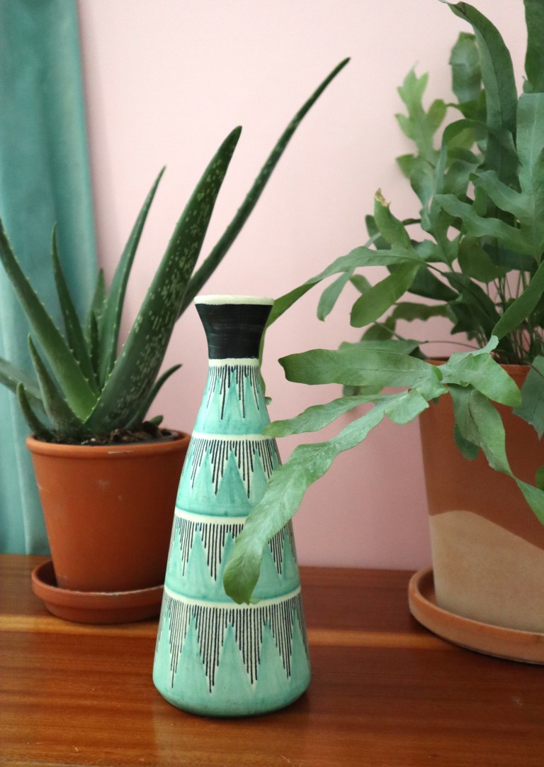
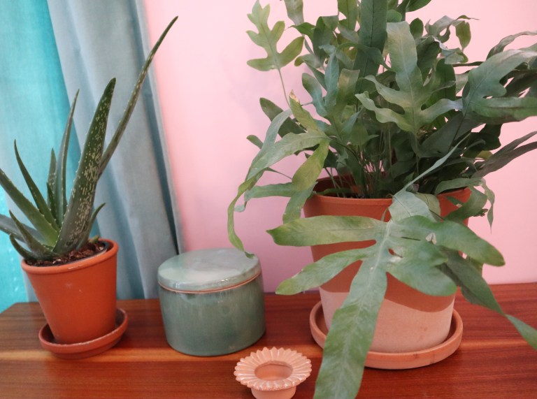
This warm pink can also be found in the interior as a shade of low-burning terracotta, even in flower pots. As its companion, the greyish green of oxidized copper harmonizes it appropriately. The fern-like Plebodium Aureum, or golden plover, is just beautiful matte grayish-green with fun-shaped leaves in its terracotta pot.
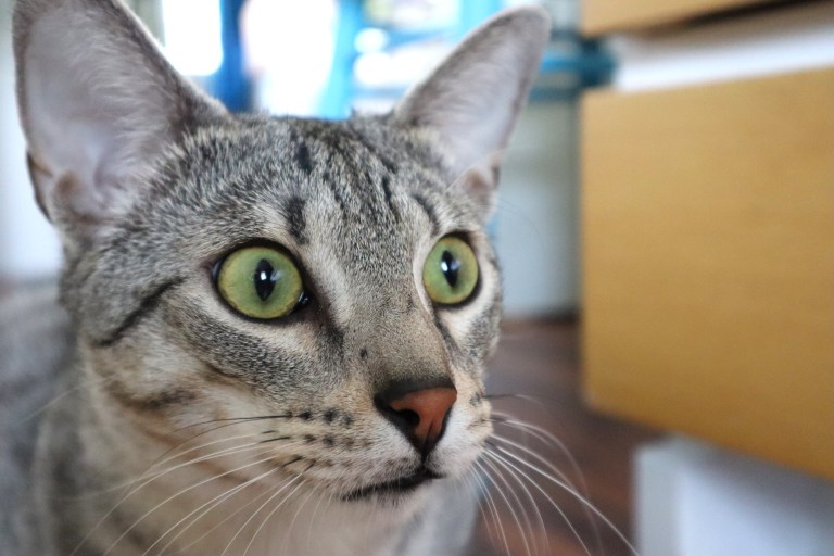
When it comes to nude, that Caruso-cat’s nose is accompanied by gooseberry-colored eyes, just right.
Vaaleanpunainen nudena on sekoitus sinooperin punaista ja valkoista. Näin opastetaan Cennino Cenninin oppaassa taiteilijoille jo 1400-luvulla. Sinooperi on luonteeltaan lämmin, oranssiin vivahtava. Opas on oiva kirja väreistä, niiden hienostuneista ja rikkaista nimistä sekä erikoisista sekoituksista. Suurin osa väreistä on italialaisia maavärejä, mutta joukossa on joitain alkemistien sekoituksia sekä kaukomaiden eksoottisia harvinaisuuksia.
Vaaleanpunainen tuntuu mielessäni aina huutavan vastaväriään, enemmän ehkä kuin moni muu sävy. Cennini ohjeistaa freskomaalareita pohjustamaan kasvot maavihreällä tai okran, mustan ja valkoisen sekoituksella (verdaccio), joka on käytännössä vihreää. Tällainen vastavärinen pohjustus saa ihon punervan hehkumaan entistä elinvoimaisempana.
Tämä lämmin vaaleanpunainen löytyy sisustuksessa myös matalapolttoisen terrakotan sävynä vaikka kukkaruukuissa. Sen kaverina hapettuneen kuparin harmahtava vihreä sointuu sopivasti. Saniaisen sukuinen plebodium aureum eli kultaimarre on juuri sellainen matta harmahtavan vihreä ja hauskan muotoisilla lehdillä varustettu.
Nudesta kun puhutaan, niin tuo Caruson nenänpää saa seurakseen karviaisen väriset silmät, just sopivasti.